Pear Technology
Overview
Pear Technology is a company that provides digital maps and mapping services. Their target sectors include rural estates, local councils and tree management. Working with their existing logo, we re-developed their branding to create stationery, brochures, pull-up banners and exhibition design, icons for their bespoke mapping software, presentation folders, and more.
Brochures
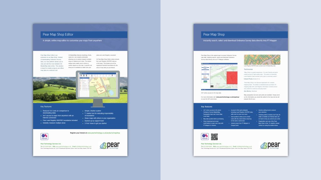
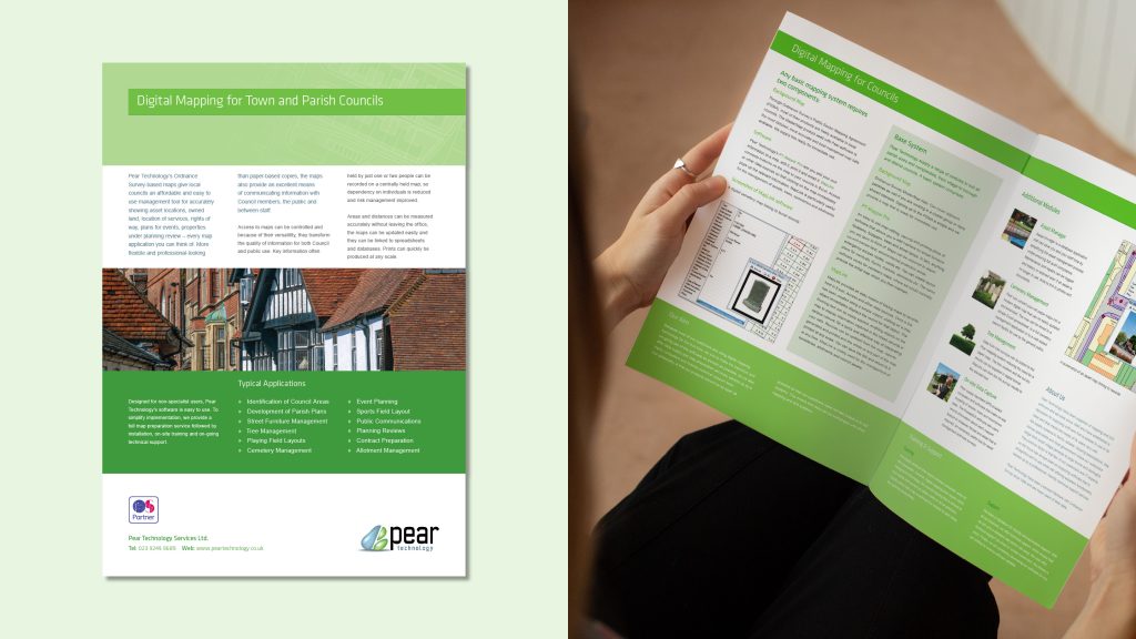
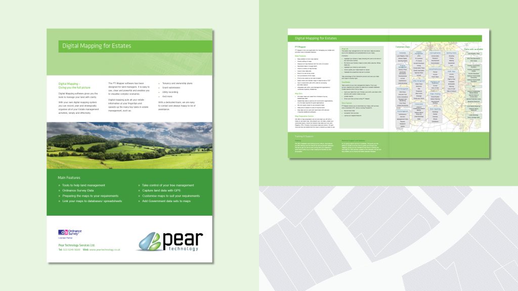
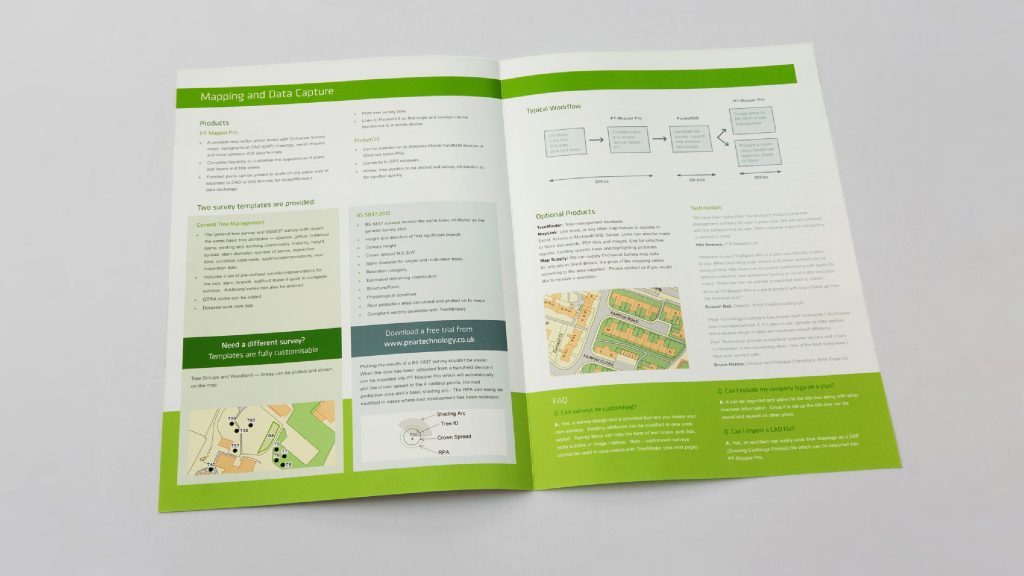
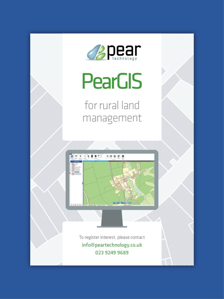
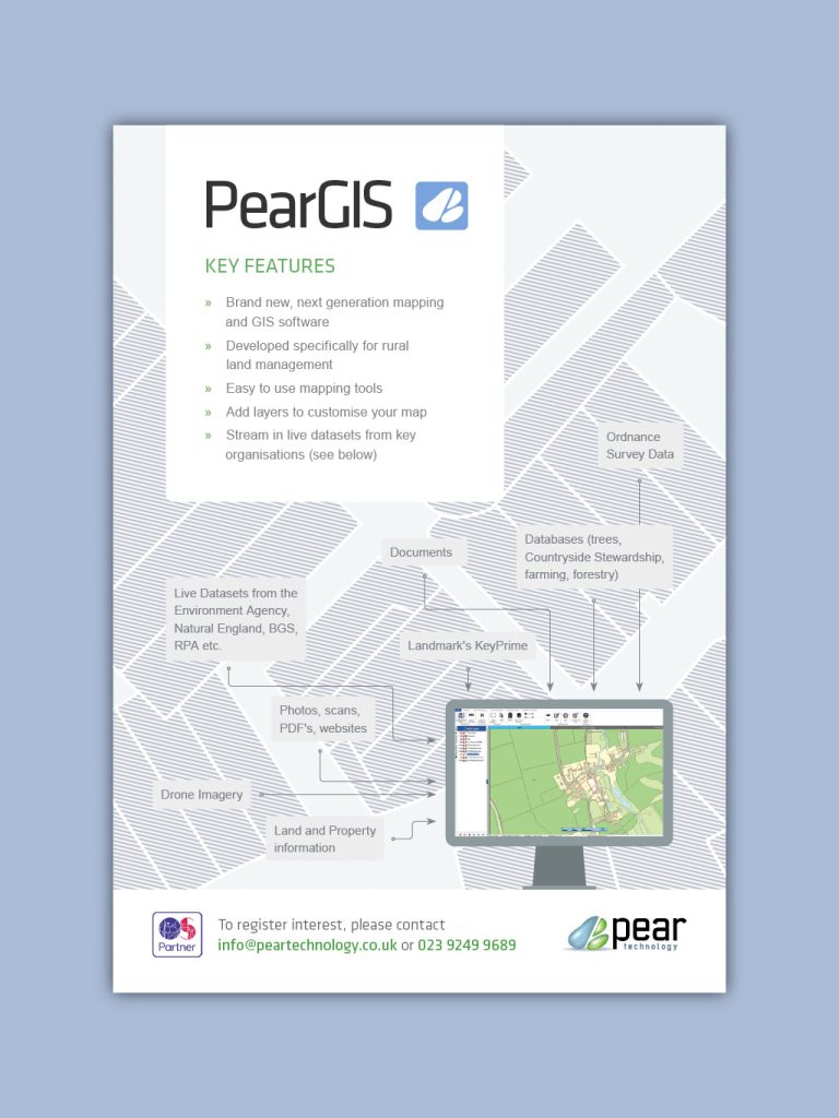
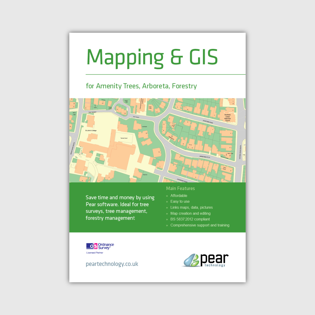
Pear commissioned a series of brochures to target their key sectors, such as rural businesses or local councils. They needed informative and easy to read brochures to advertise their mapping services and products. Varying in length, the brochures all feature in-depth details about the different areas of Pear’s mapping expertise, and had to convey the information in an accessible way.
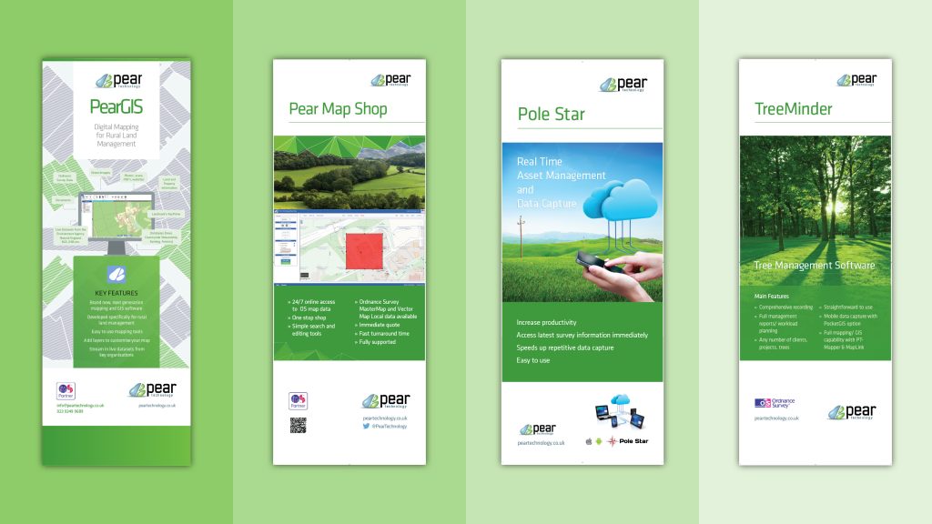
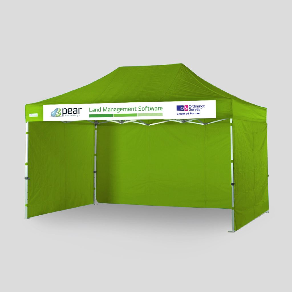
Pull-up banners and exhibition design
An important way for Pear to reach new customers is by attending exhibitions, events and conferences such as the Farm Business Innovation Show and others. For this they needed an eye-catching exhibition stall to draw in potential new customers. we designed the posters and large pull-up banners that are displayed at the exhibition stall as well as a large format banner for their exhibition tent.
Icons
As part of the release of the latest version of Pear’s mapping software they comissioned a bespoke icon set for the ribbon tool bar. The icons had to be clear and easy to read across different devices. Recognising that mapping, CAD and GIS software was often too expensive and too complicated for people whose specialism were in non-IT areas Pear’s focus has always been on ease of use without sacrificing on functionality.
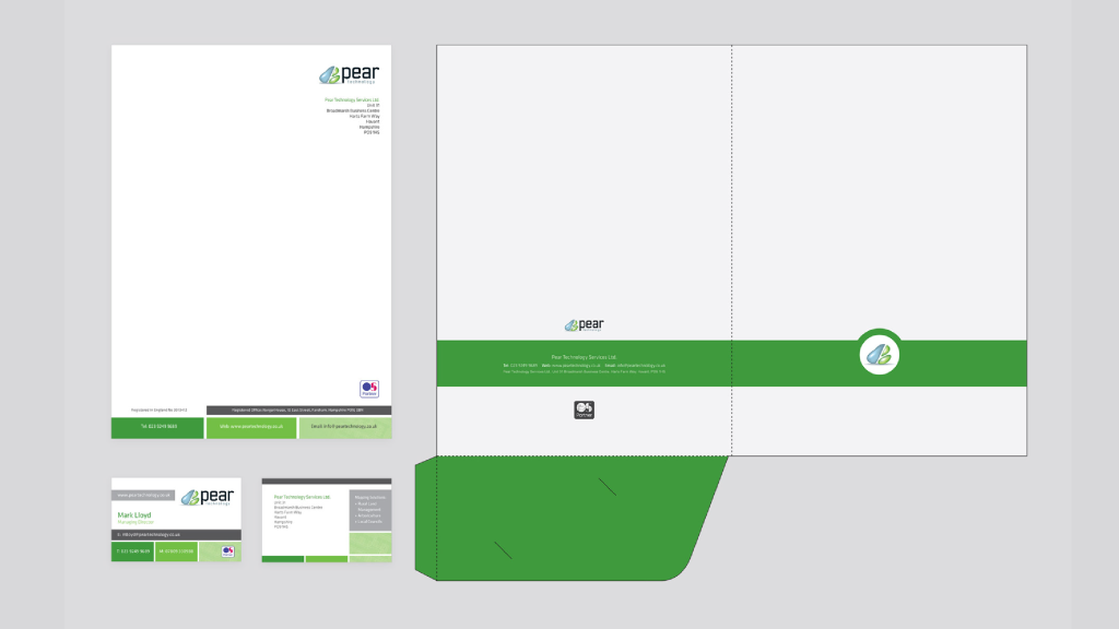
Stationery
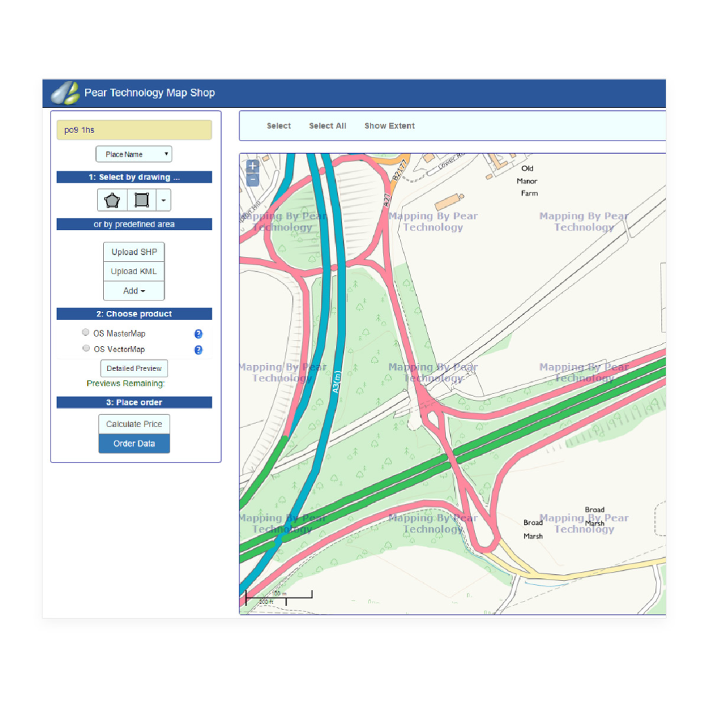
Pear Map Shop
The brochure for Pear’s 24/7 online mapping service Pear Map Shop had to match complimentory blue colour scheme to differentiate it from Pear’s other assets.